Our Logo
LOGO USAGE
Every logo has a story. Verdin′s core values are at the heart of our personality and expressed through the logo.
We achieve this by setting "Verdin" in a sturdy, dependable typeface symbolizing our stance that there is no substitute for integrity. Joining two letters into one, the square is symbolic of Verdin′s emphasis on relationships, as well as our dedication to the strategy and innovation that defines our approach. The red burst of color is a small, but mighty expression of our passion and purpose.
The Verdin logo is the best representation of the agency and all that we offer. It is a valuable asset that must be used consistently and in the proper, approved forms.
Full Color
The full color logo should be used as often as possible to build a strong brand identity.
Grayscale
Use this logo when printing in black and white—for example, in a newspaper publication.
Black
Use this version of the logo when it is represented at very small size (under .25”). Whenever possible, please defer to the other options.
Full Color Reversed
If the logo is to be overlayed on a dark/photo background, the full color reversed version of the logo should be used in most cases.
White Reversed
If the logo is to be overlayed on a dark/photo background, the white version of the logo could be used when competing with the red square.
Full Color with Tagline
The full color logo with tagline should be used on materials that introduce Verdin to prospective clients, e.g. external forms, ads and collateral that reach a new audience.
Minimum Size
The logo should always be clearly legible and should never be smaller than a quarter inch (.25”).
Clear Space
When placing the logo within artwork, please maintain a padding of clear space around the logo of the width of the “VE” all the way around the logo. In other words, no image or other text should extend into this padding area.
Our Logo
BACKGROUND USAGE
Sometimes the logo will be placed over images or visually complex backgrounds. Always make sure the logo can be easily seen. The full color logo is preferred, but the white logo is acceptable if it can be easily seen. The left column shows unacceptable logo usage, which the right column shows how to correct it. When the logo is placed over a photo, on a color background, or on a pattern background, it must be white when the background is darker and full color when the background is very light.
The Type
TYPOGRAPHY
The brand typography must also speak to the Verdin personality and values. Strong, dependable and straightforward, the primary typeface is Interstate. This typeface was crafted based on the signage alphabets created for the Federal Highway Administration and ideal for quick and clear communication. Miller, on the other hand, is a friendly, approachable and classic typeface. Its sophisticated appearance compliments the bold presence of Interstate. As with our logo, consistent use of the brand typefaces reinforces Verdin’s overall brand identity and personality. Interstate and Miller are the two primary typefaces, while Arial may be used for digital correspondence.
V
Interstate
Sans-Serif:
This typeface should be used as the primary font within any collateral or marketing materials. Its bold simplicity compliments the delicate elements of the serif font, Miller. It is easy to read and has a multitude of font styles for variety.
All styles are acceptable, but please use Regular, sentence case for body copy.
V
Miller
Serif:
This typeface should be used more sparingly than Interstate. Depending on the application, it may be considered an accent font to provide more variety and depth in design. It is classic and sophisticated.
All styles are acceptable, but not for use on body copy.
V
Arial
Digital/E-mail:
For digital correspondence and internal communication, Arial may be used if none of the other brand typefaces are available. It is available on most computers and can be consistent from computer to computer. This should NOT be used in printed collateral or external marketing materials.
All styles are acceptable, but please use Regular, sentence case for body copy.
The Color
COLOR PALETTE
The Verdin color palette is simple, bold and eye-catching. The neutral grays are timeless, professional, classic and elegant. The small bursts of vibrant red are energizing, powerful and demanding.
Here are the color breakdowns for each production format. CMYK colors are used for any basic printed materials (flyers, brochures, documents, menus, etc). RGB colors are used for any digital materials (social media, e-newsletters, website, TV advertisements, etc). The web safe colors are similar to RGB and are only used for digital materials.
The six-digit code is an easy way to add specific colors when changing web design preferences. Pantone colors are only used for offset printed materials, usually with color-critical pieces such as business stationary with typically two colors or less.
PANTONE 174-16
C 65 | M 48 | Y 37 | K 60
R 51 | G 62 | B 62
#333e48
PANTONE 199
C 7 |M 100 | Y 85 | K 1
R 220 | G 30 | B 53
#dc1e35
PANTONE 428
C 23 | M 17 | Y 17 | K 0
R 195 | G 197 | B 200
#c3c5c8
The Message
TONE OF VOICE
Messaging is key in communicating the Verdin brand and personality to the public. It’s important to maintain a consistent and accurate voice to ensure a strong brand.
The goal when crafting this message is to:
Evoke
the voice of someone...
genuine, smart, approachable, sophisticated, kind, clever, passionate, confident, thoughtful, professional
Avoid
the voice of someone...
sarcastic, condescending, self-important, indirect
The Personality
IMAGERY
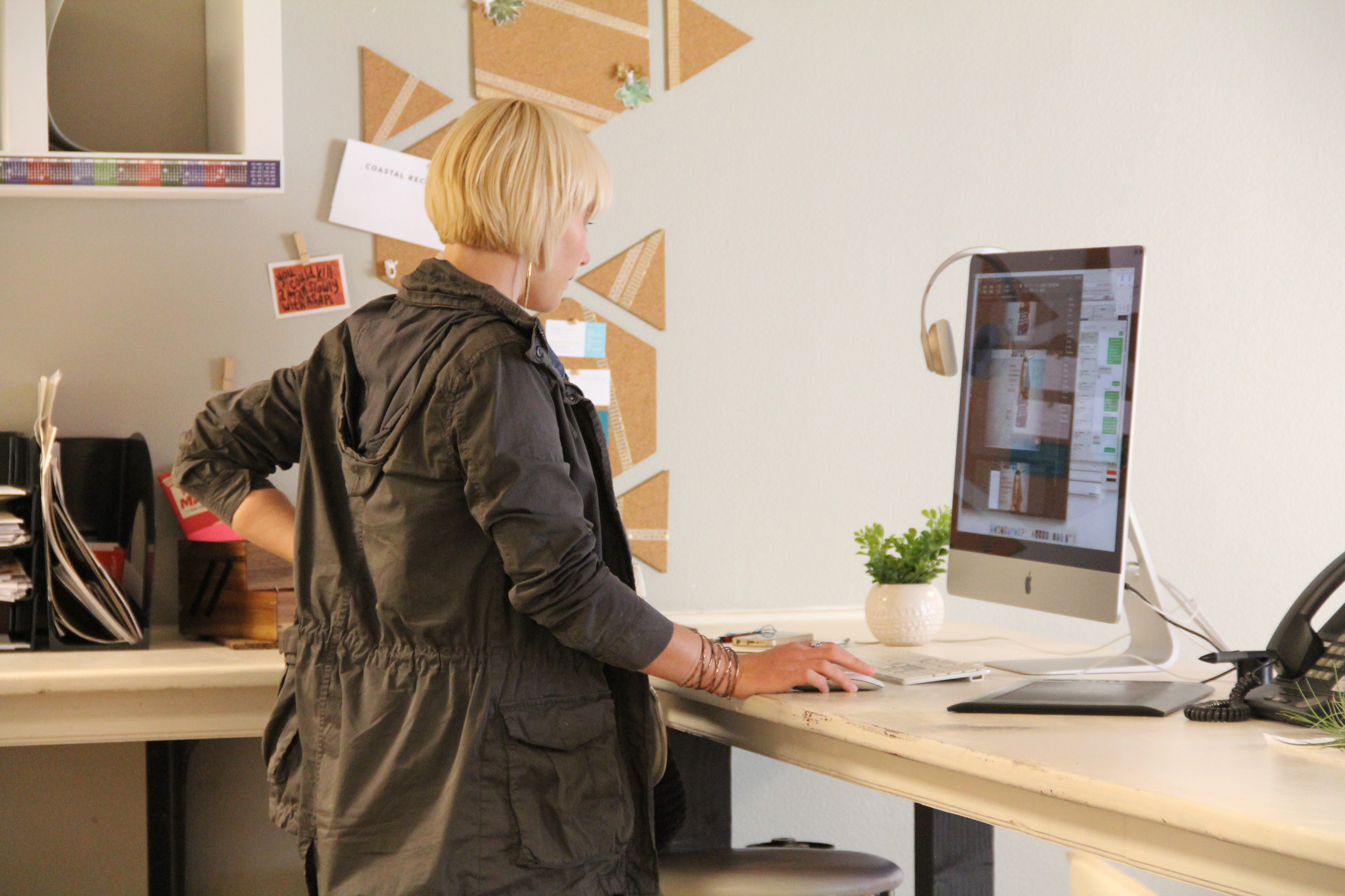
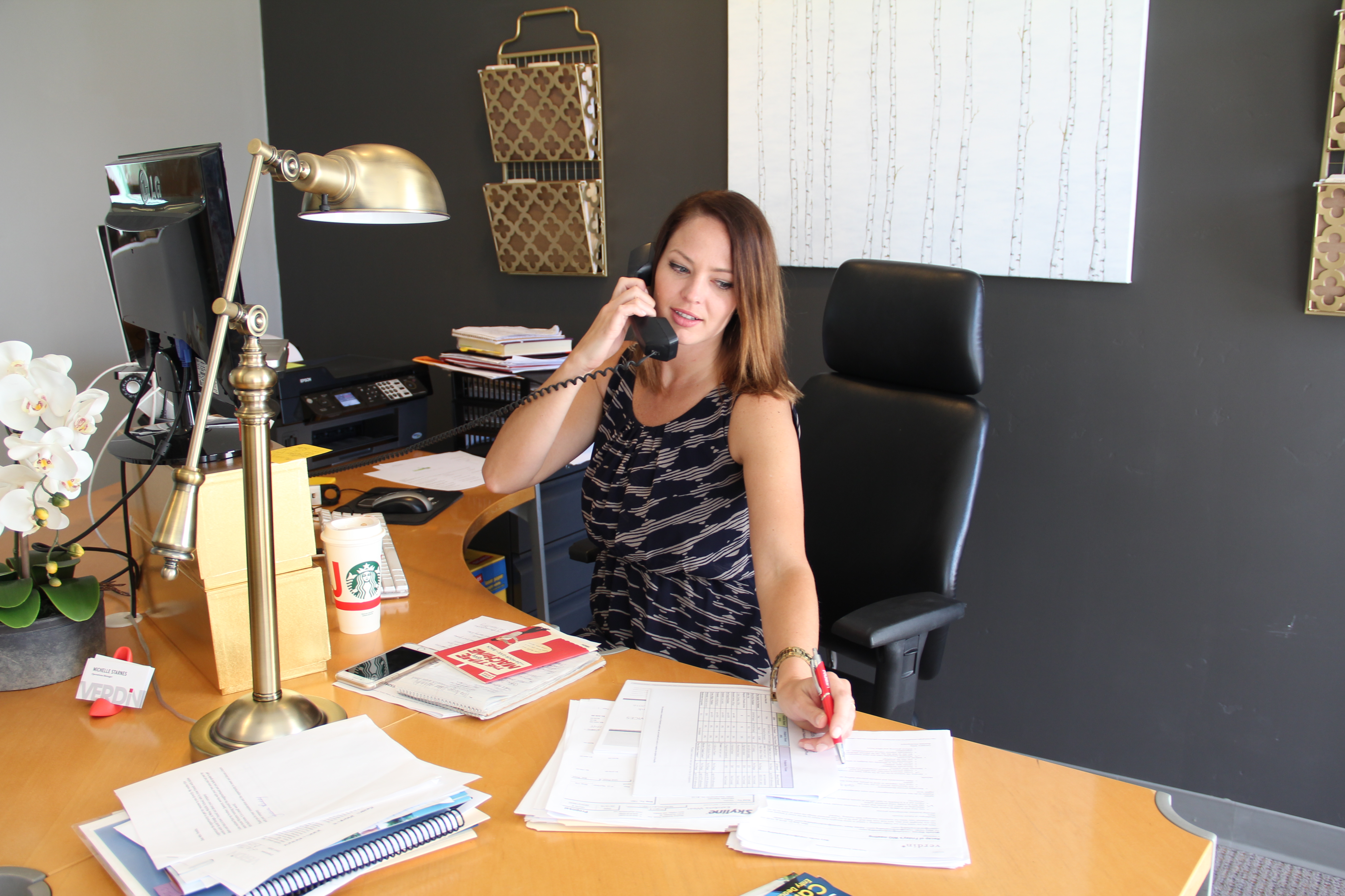
A picture is worth a thousand words. Therefore, the imagery and photography used within the Verdin brand must be carried out properly.
Whether in black & white or in color, Verdin’s imagery is high quality and straight-forward. All photography must use natural light as much as possible. The imagery does not have to be serious in nature, but should be authentic and effortless.
The Personality
GRAPHIC ELEMENTS
The red square is Verdin’s strongest and most important visual asset. As the signature of Verdin’s passion and purpose, it can be used both as a strong visual focus or as a pop of accent color throughout materials.